Classic Window Fashions
The site now sells the one thing the customer is afraid of: an expensive mistake.
Lisa Fielding has run Classic Window Fashions since 2008, measuring, ordering and installing custom treatments across Dallas-Fort Worth. One of her clients spent five thousand dollars on big-box shades, hated them, and replaced them all with Lisa’s shutters. That story became the whole strategy. The customer’s real fear is not price. It is paying twice. The rebuild, from brand and logo through copy and site, is built around a simple promise: come see us first and you will only buy once.
The bottleneck
A fifteen-year installer had no brand, no process on the page, and no reason to trust her over the big box.
The homeowner shopping for treatments is doing the designer’s job alone: guessing at fabric, light, measurements and motor options. Most guess wrong once before they call a professional. The old presence gave Lisa no way to say, in the first screen, that she is the step that prevents the mistake.
The rebuild
A new identity, a three-step process, and a consultation form that opens on the splash page.
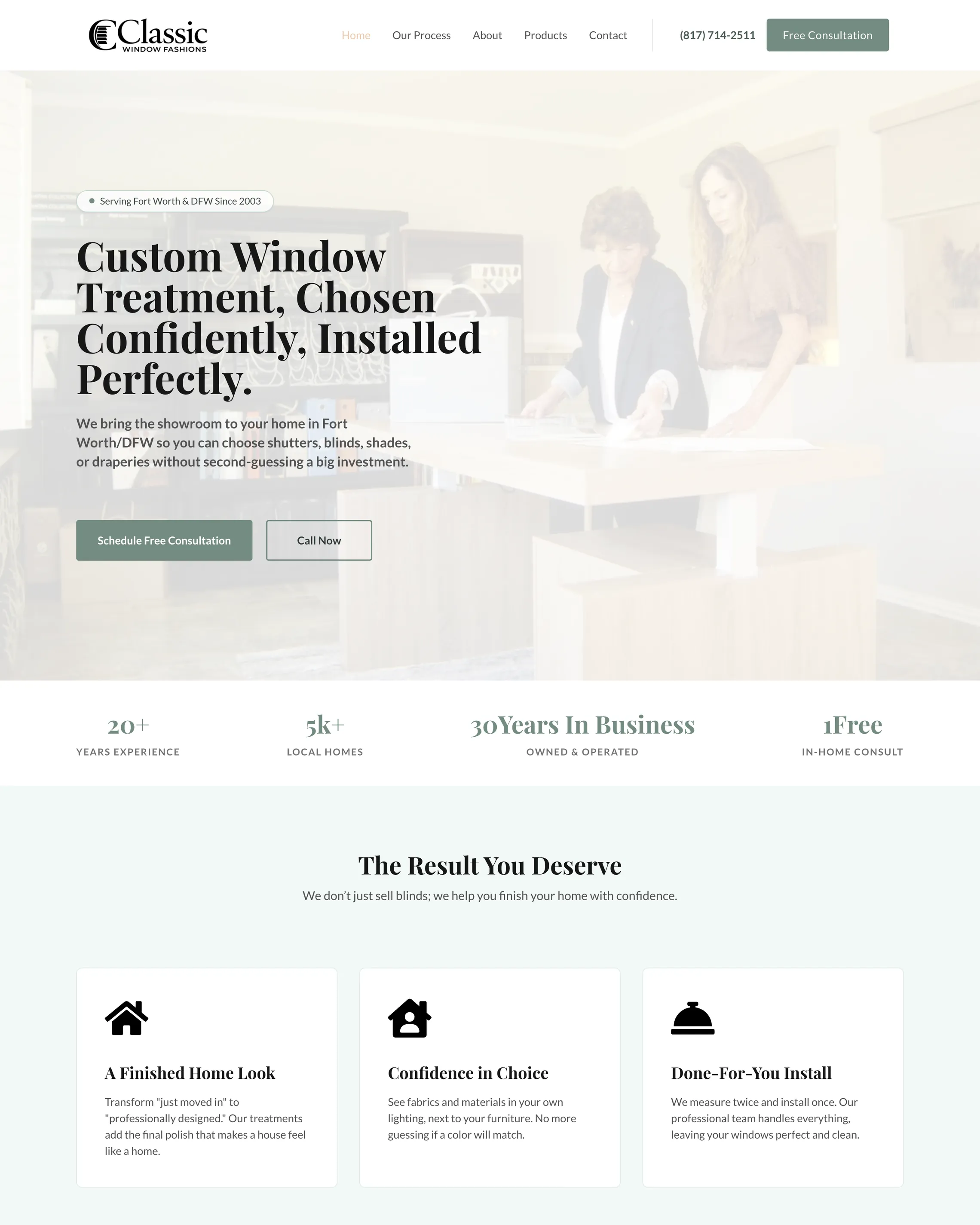
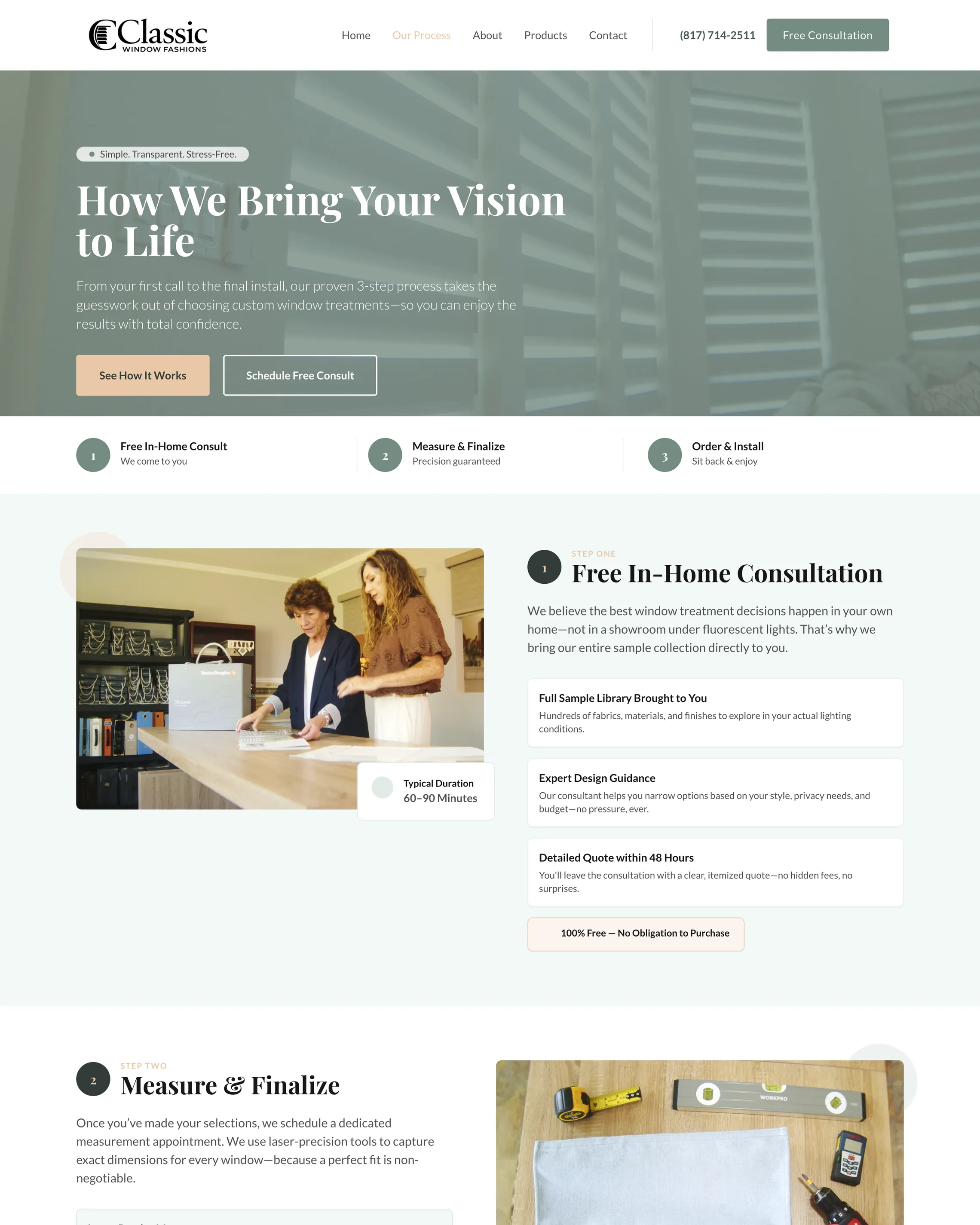
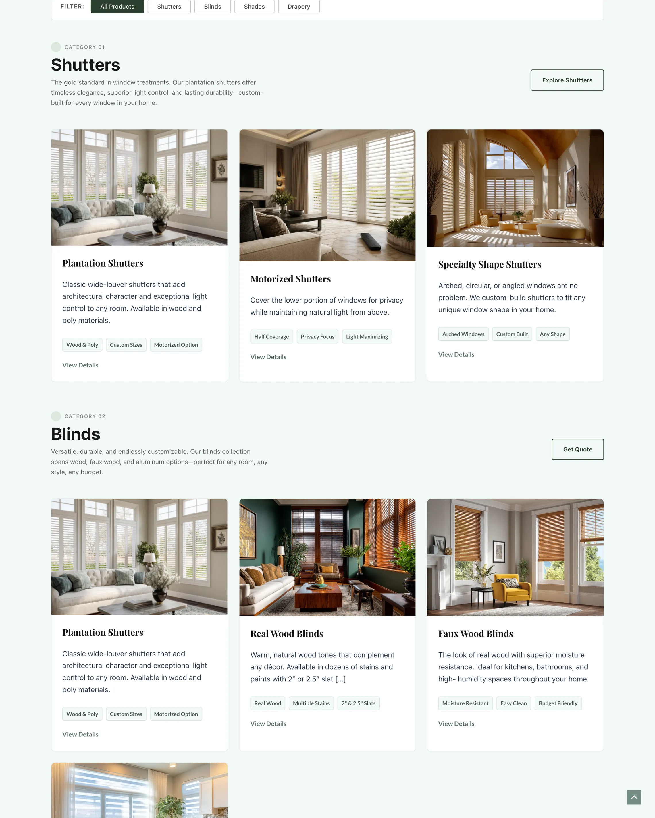
The work started with a Customer Saga workbook, then a logo in sage green and polished gold that skipped the square blind icon every competitor uses. The site runs on three steps: schedule a visit, we design and handle it, enjoy the home. Warranty, energy efficiency, child safety and privacy each got their own section because each one is a mistake a homeowner has made before. Cafe shutters came off the menu. Motorized went on.
Homepage first screen, the three-step Our Process page, and the shutters section of the product collection with motorized shutters.
Above the fold
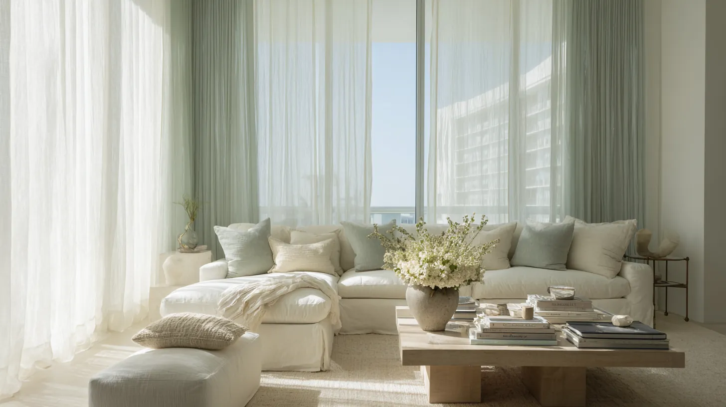
One sunlit room and an open form. No button to find, no page to load.
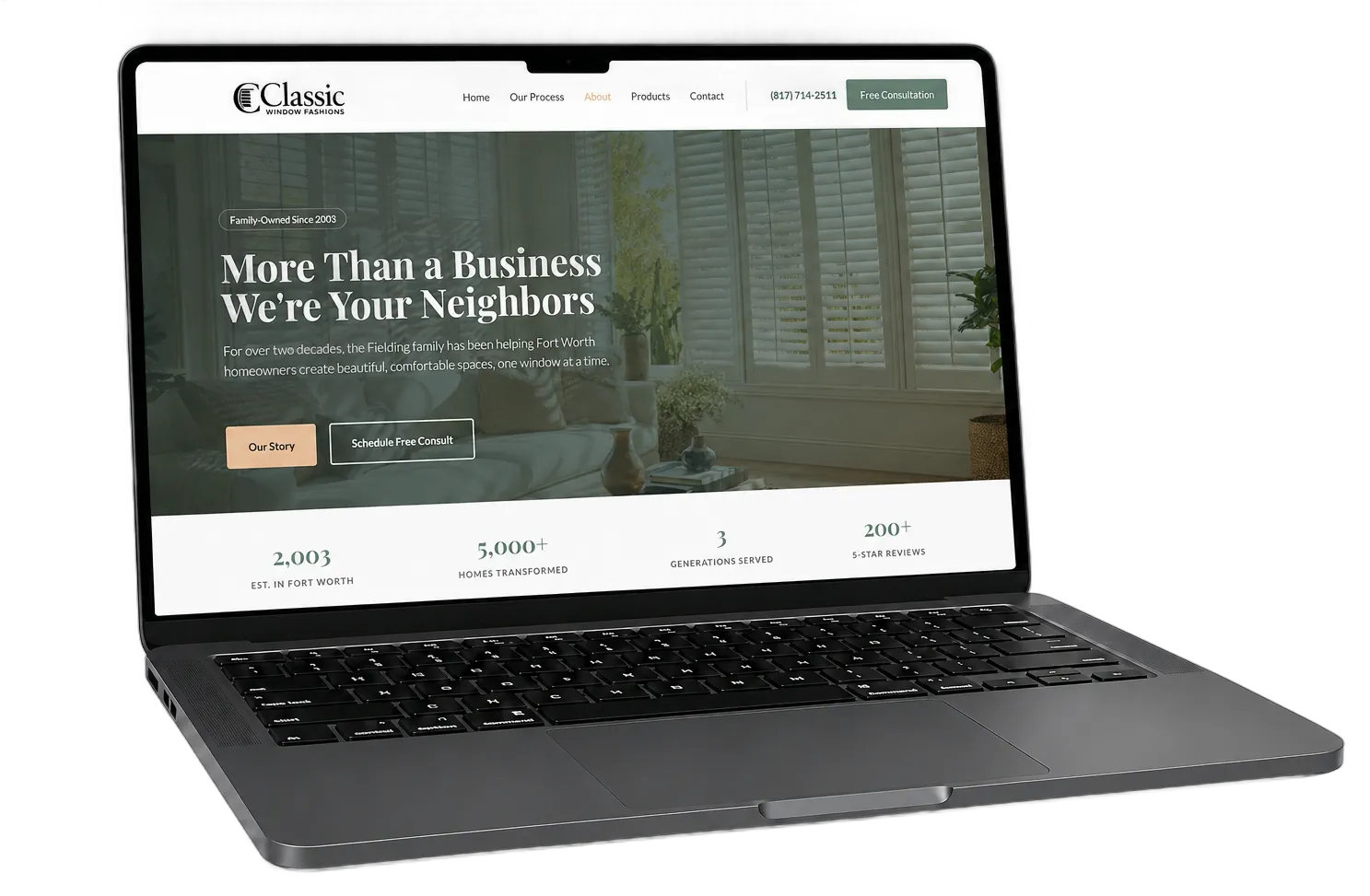
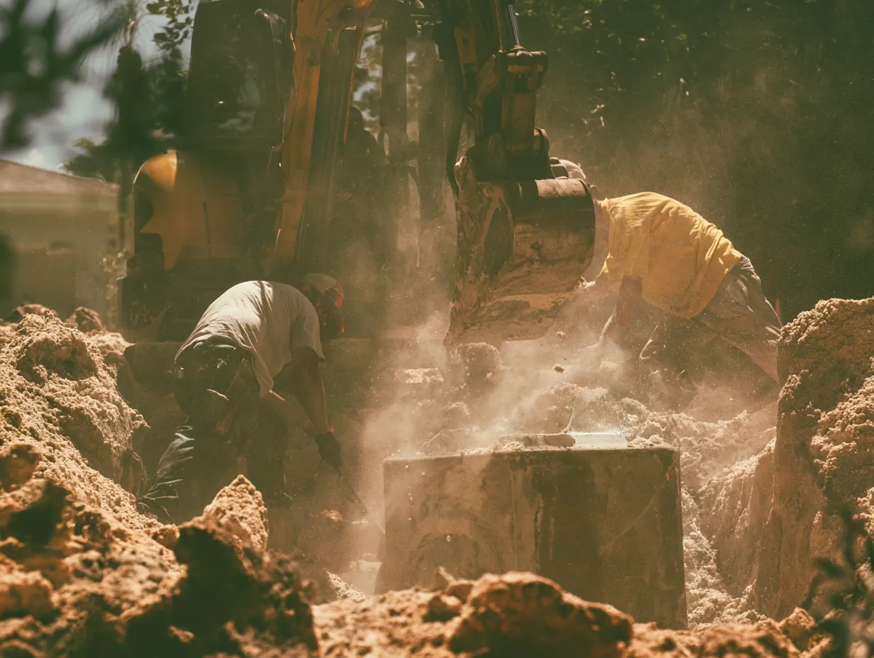
The consultation request is a live form on the splash, not a button that leads to one. The photography launched with placeholders while Lisa recovered from surgery, then a one-day shoot across three client homes replaced them. No installer names or faces appear anywhere on the site. That was a hard requirement, and it was honored.
The homepage first screen. The finished room leads, the consultation form is already open.
On every screen
The ads run on Instagram and Facebook, so the site was built for the thumb that tapped them.
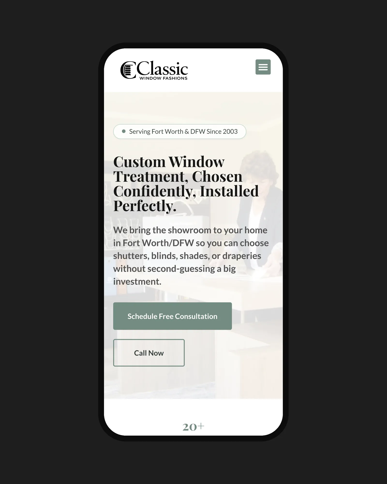
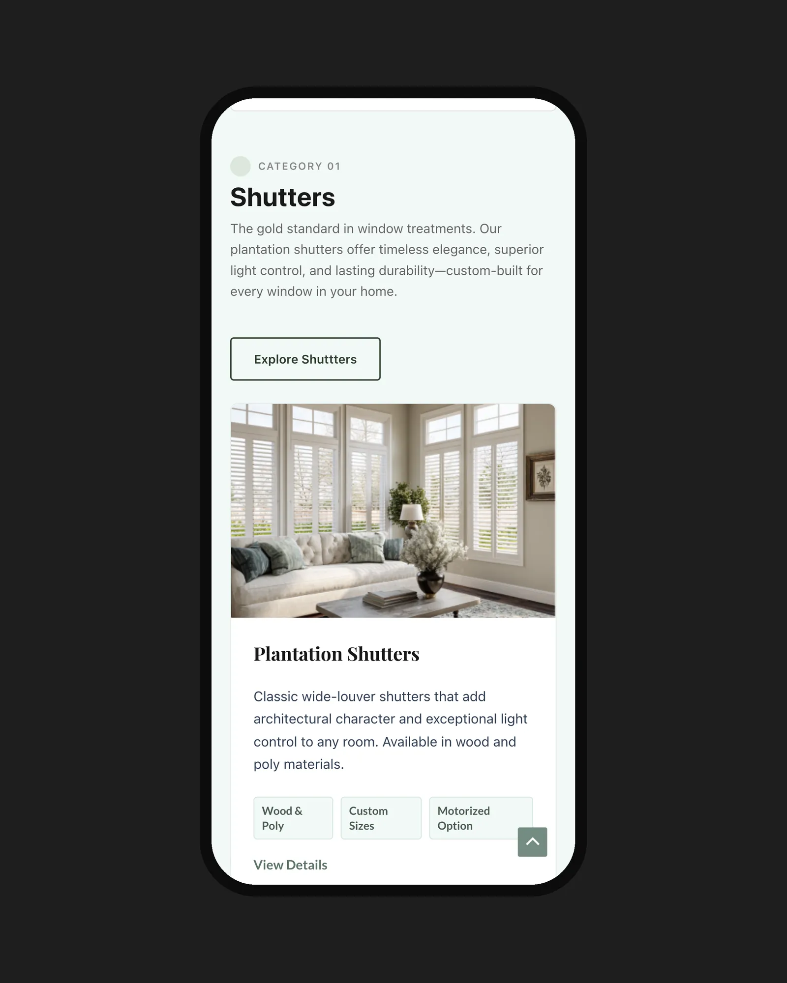
Paid traffic from affluent DFW neighborhoods lands here on a phone. The room loads first, the form sits under it, and the three steps read in one scroll. The measuring tape comes out at the consultation, not on the website.
Homepage and the product collection on a 390px phone.
Johns By John