Studio Chapman
A site the architect was embarrassed to share now opens on the work, edge to edge.
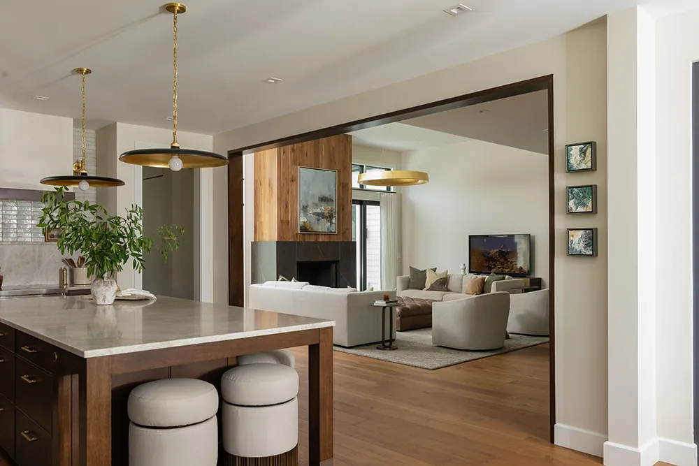
Dru Chapman designs custom homes for clients across West and Northern Michigan, from Grand Rapids to Torch Lake. Her clients build one to four million dollar houses and they do not like flash. Quiet money. The old site was clunky on a desktop and broken on a phone. It even got the firm’s name wrong, calling it Studio Chapman Architects. She told me she was embarrassed to send the link. The rebuild was built to be sent: full-bleed photography, a book-gallery portfolio, and three quiet motion pieces that make a still house feel lived in.
The bottleneck
Mismatched fonts, overlapping photos, no contact form, and a site name the firm never chose.
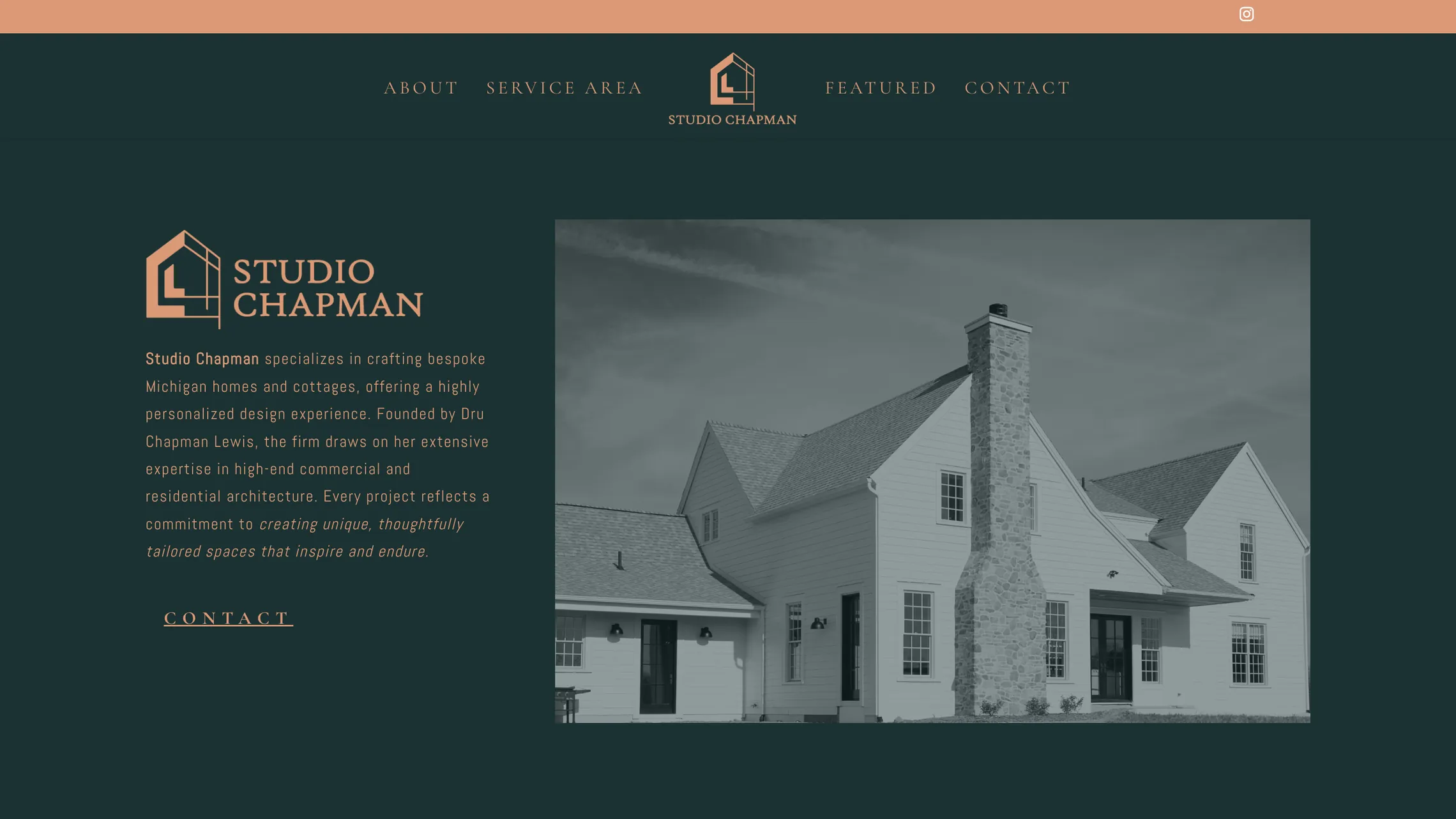
The old site came from a template built for a different firm. Photos misaligned, elements overlapped, and nothing reflowed on a phone. There was no web form and no press page. For an architect whose whole pitch is proportion and restraint, the website was the one thing she had made that looked careless.
The old site, still live at studio-chapman.com. Green and peach, a template header, and a firm name the studio never chose.
The rebuild
Full-bleed houses, a book-gallery portfolio, and one page that shows how the work actually gets made.
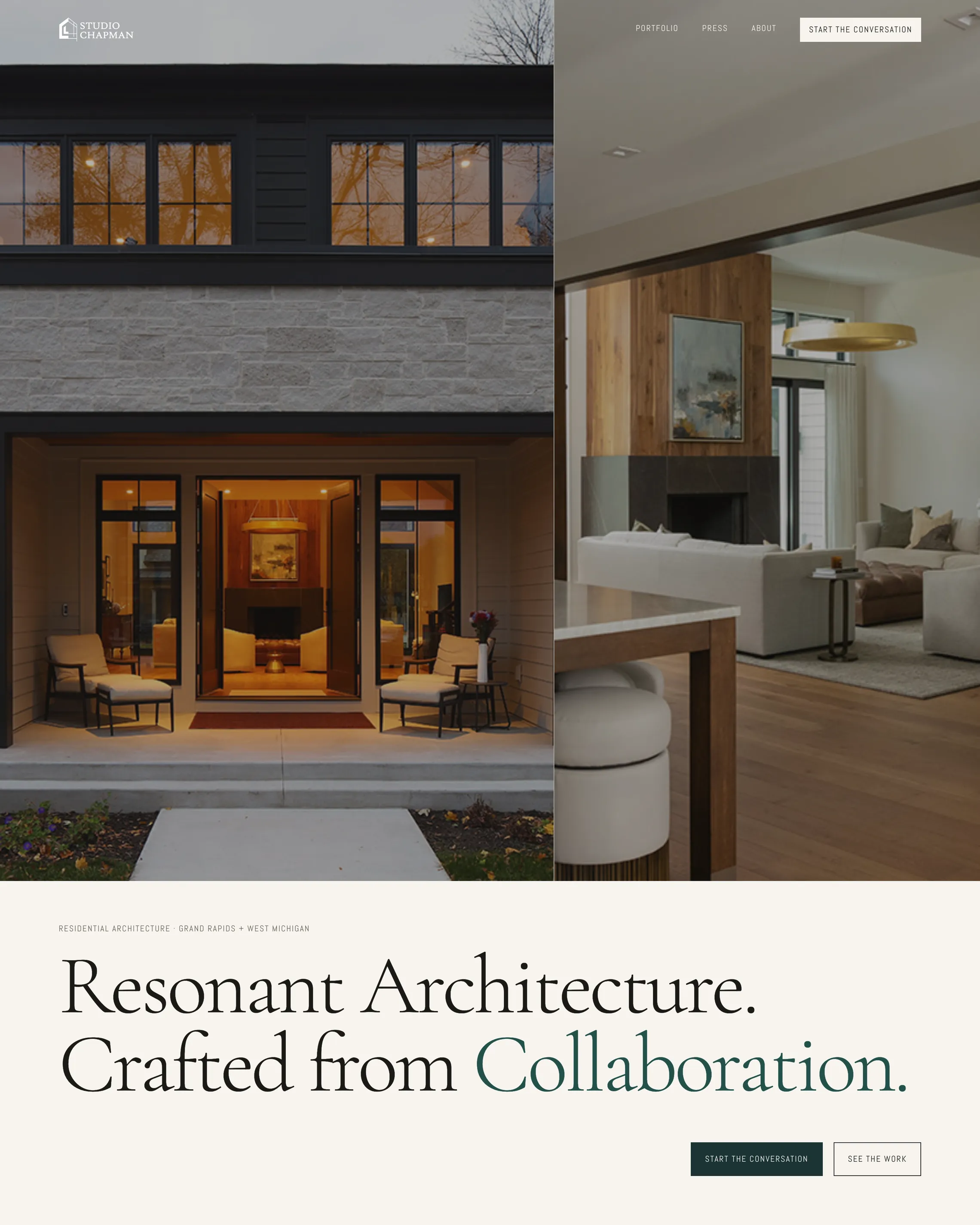
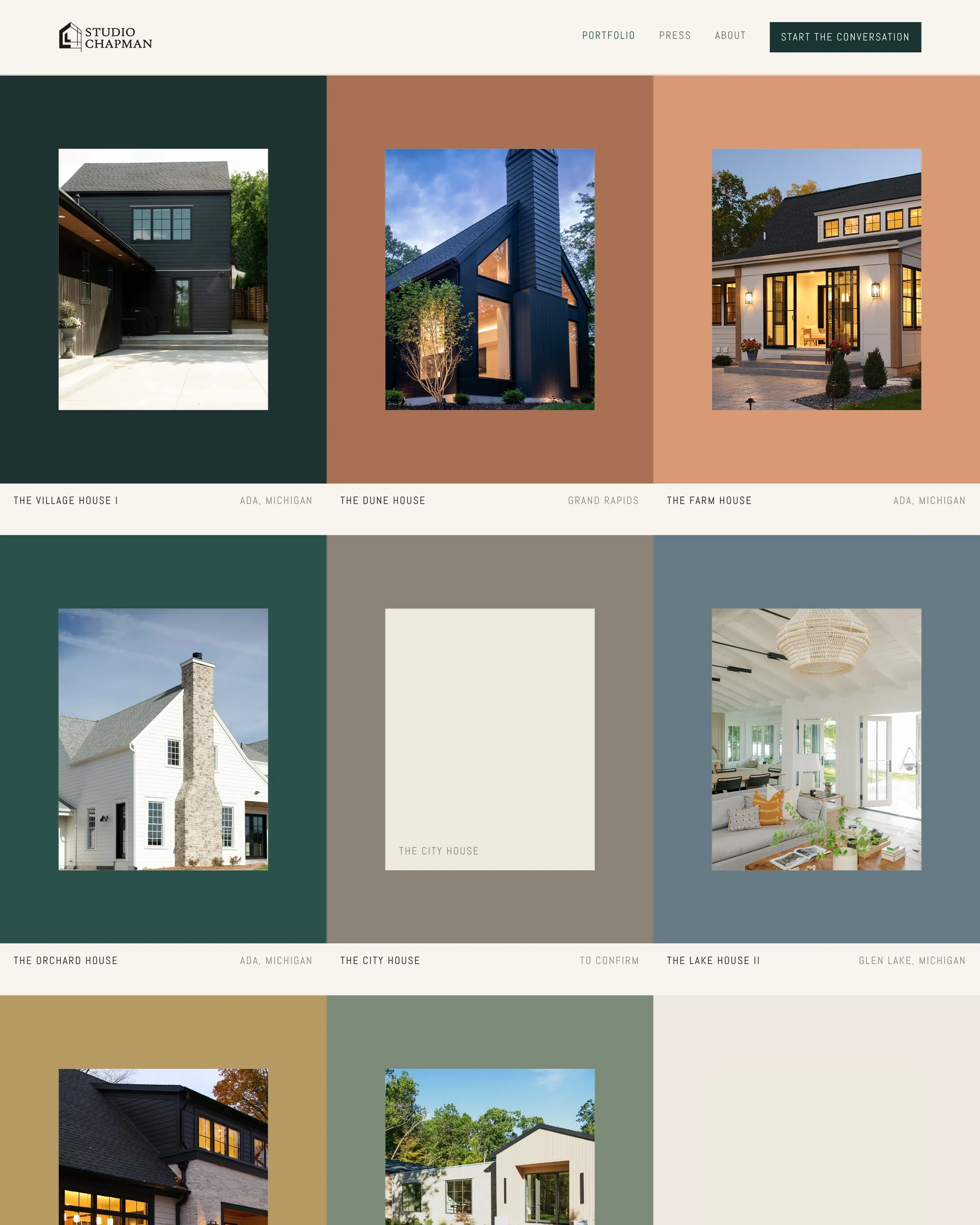
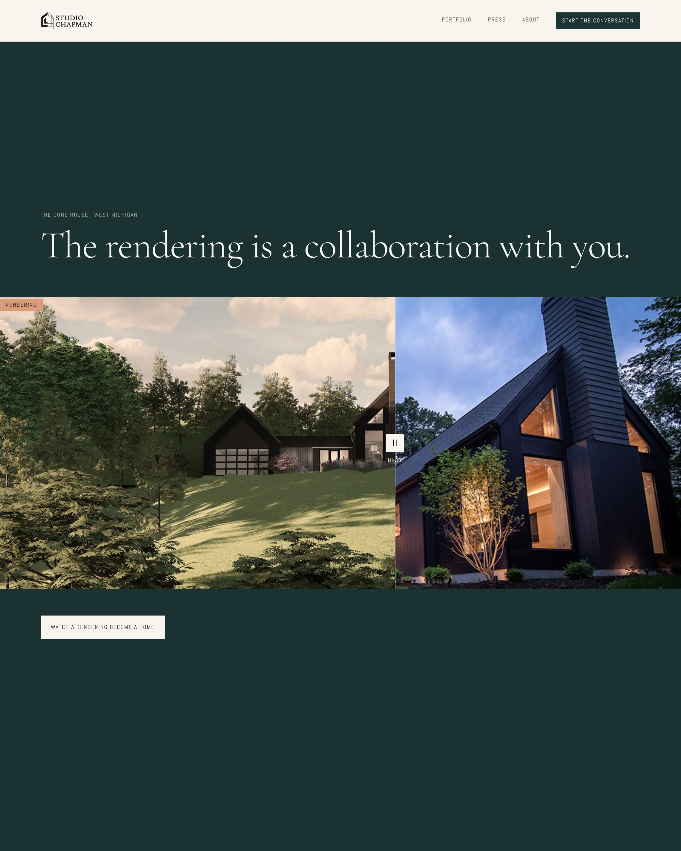
Every architect claims collaboration. This site proves it. A scroll-driven Design Process section walks from the first 2D drawings to renderings to the finished build, so a prospective client sees the workflow before the first meeting. Project pages carry a render-versus-reality slider that puts the original rendering against the finished photograph. The palette moved from the old green and peach to terracotta, light oak and off-white, borrowed from plaster and stucco.
Homepage first screen, portfolio grid, and the rendering versus reality slider that anchors the Design Process section.
Above the fold
One finished house, four nav words, one button. The quiet money aesthetic, executed.
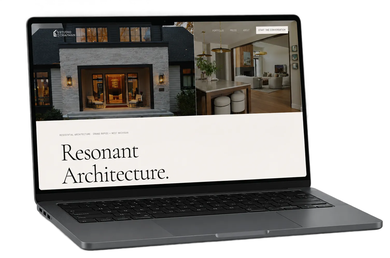
The reference was Studio Ashby: sophisticated, understated, no tricks. Three subtle motion loops sit inside the photography, curtains moving, wind in the trees outside a farmhouse. Enough to feel alive, never enough to feel like a hat trick. A logo animation was pitched and cut for exactly that reason.
The homepage first screen. Saturated, full-spread photography with a single line of context.
On every screen
The old site could not be read on a phone. The new one was designed there first.
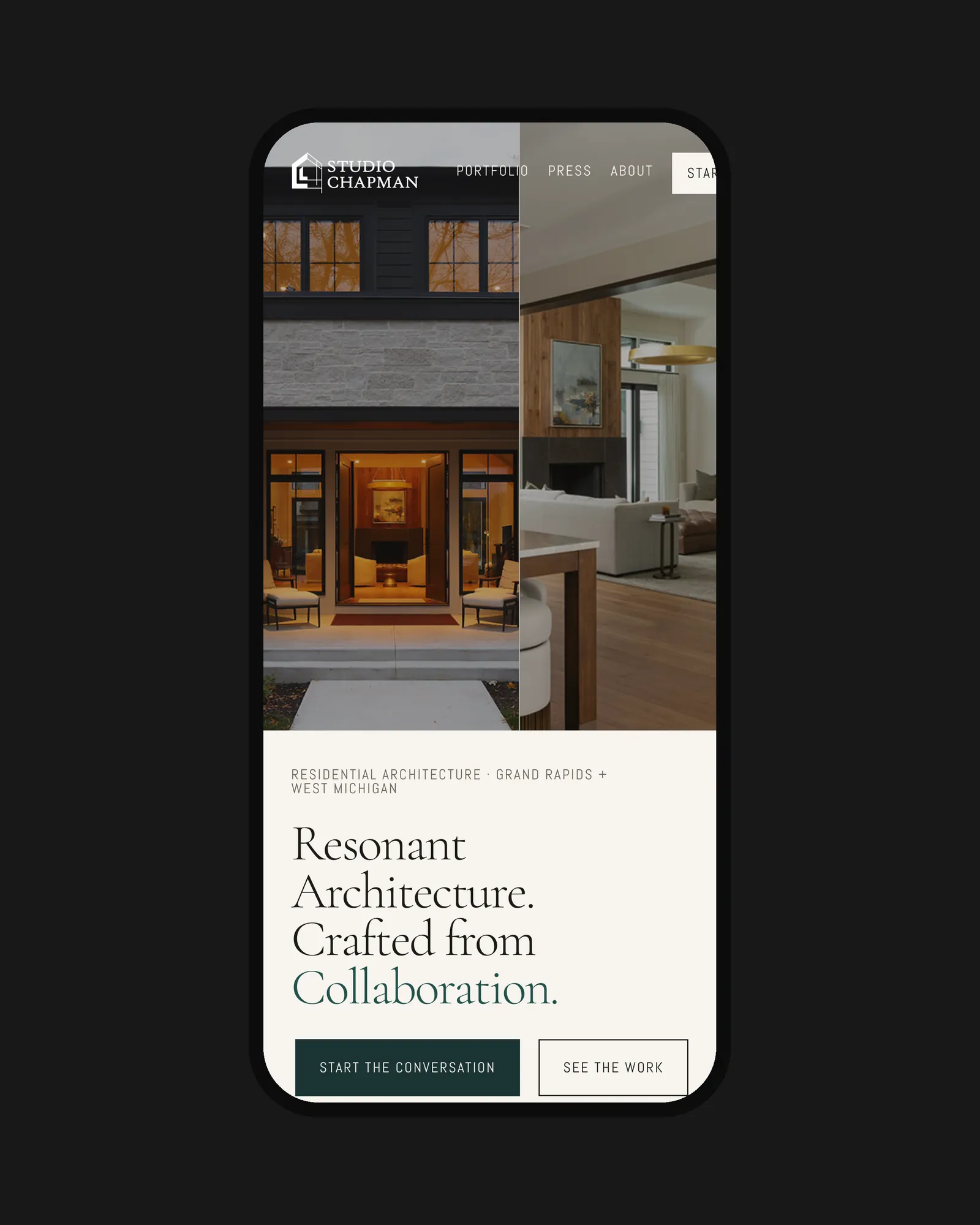
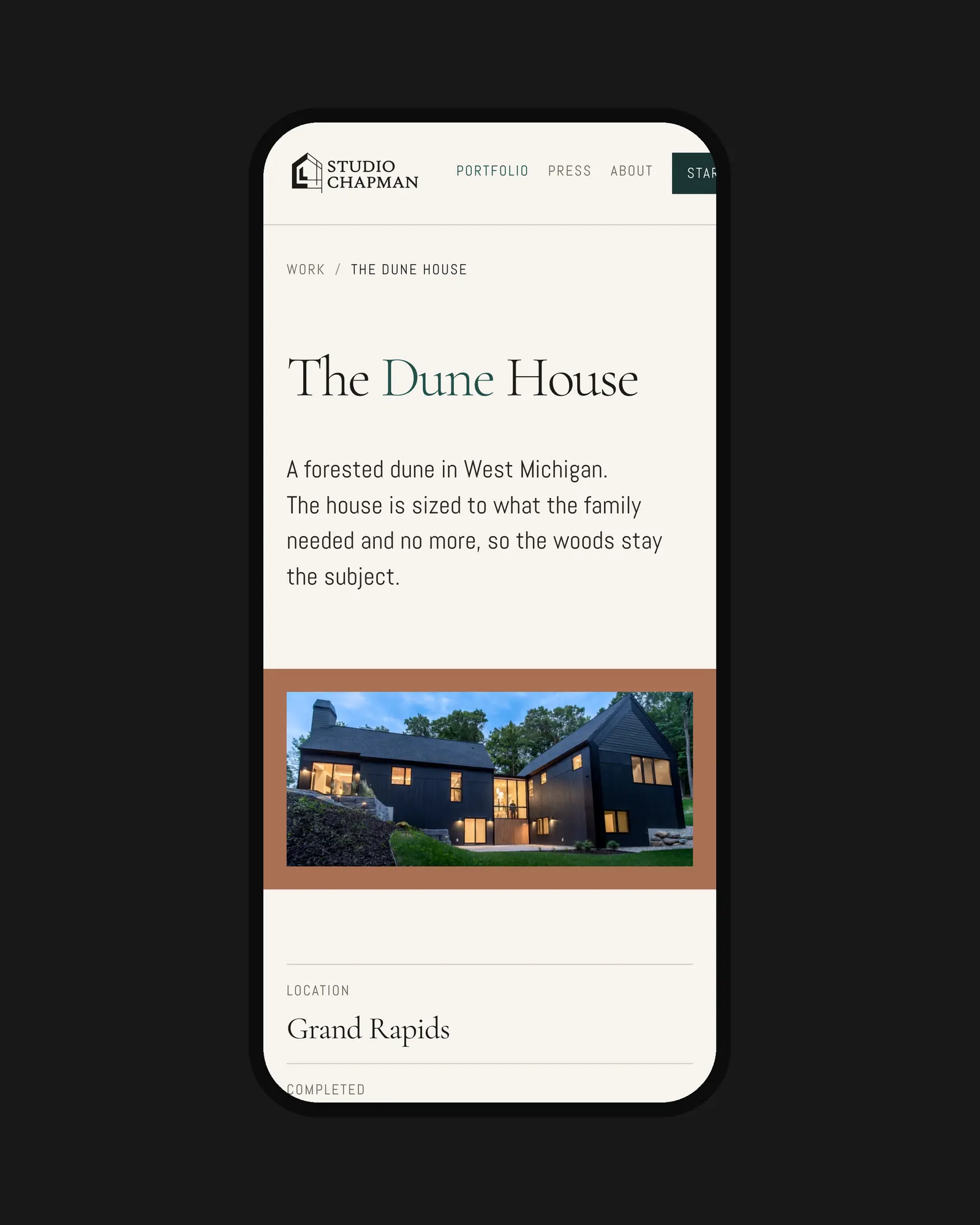
One column, one house at a time, and the personal story woven through so a visitor meets the architect, not just the portfolio. Clients hire the person. The phone build makes sure they meet her.
Homepage and The Dune House project page on a 390px phone.